> For the complete documentation index, see [llms.txt](https://docs.elitebundleapp.com/llms.txt). Markdown versions of documentation pages are available by appending `.md` to page URLs; this page is available as [Markdown](https://docs.elitebundleapp.com/customize-and-publish/product-data.md).
# Product data
Show the SKU, vendor, stock left, savings, add-on labels or metafields on bundle cards, quick view, the cart and bundle items, from the live preview.
**Product data** puts your product information in fixed spots on a bundle: badges in a corner of the image, a line under the title or price, a text block, a line or a badge on each cart item. Each spot has a set look, so you only choose what goes in it: your own text with variables for product data such as the SKU or vendor, or a text, number, date, URL or colour metafield. There is no settings page for it: you fill each spot right in the editor's live preview. It works on all three bundle types.
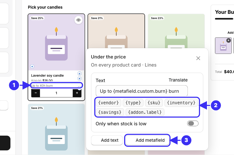
① The spot under the price, ② variables you can add to the text, ③ Add metafield
## Add data to a spot
{% stepper %}
{% step %}
In the editor's preview, hover a product card or the cart. On a multi-option bundle, hover an option; on a fixed bundle, "In this bundle". A small **+** appears at each empty spot, taking no space in the layout; point at one to see its name. Spots that already show data display real values, with a thin outline when you point at them.
{% endstep %}
{% step %}
Click a **+** or a spot, or focus it and press **Enter**. A popover opens beside it with the spot's name and where it applies, for example **Above the title** and *On every product card · Lines*.
{% endstep %}
{% step %}
Choose what to show:
* **Add text**: your own words, with variables for each product's data. Type `By {vendor}` and every card shows its own vendor. The variables sit under the text box: click one to add it to the end of the text.
* **Add metafield**: pick a product metafield, and the spot shows its value.
The preview follows as you type or pick.
{% endstep %}
{% step %}
Add up to 3 lines per spot; each line's settings stay open in the popover, and its bin icon removes it. Close the popover with the **X** button, **Esc** or a click outside, then save with the save bar.
{% endstep %}
{% endstepper %}
The preview's cart starts with two of your products, so its spots show real data, followed by at least two placeholders (rows, or empty squares in the **Slots** item style) that show where more picks land; remove the products or add others as you like, it changes nothing in the bundle. A line with nothing to show on a product (no vendor there, stock above its limit, no next discount) still appears in the preview, faded, so you always see what you added; shoppers don't see it there. While a popover is open, every copy of its spot is outlined. The **Design** tab's list shows a **Product data** hint as a reminder: hover the preview, click **+**.
{% hint style="info" %}
**Quick view spots** (build your own bundles): switch the preview from **Bundle** to **Quick view** with the switch above it, or open a product's quick view from its card in the preview, then hover the quick view.
{% endhint %}
## Where the spots are
{% tabs %}
{% tab title="Build your own bundle" %}
| Where | Spots |
| --------------------------------------------------------- | ---------------------------------------------------------------------------------------------------------------------------------------------------------------------------------------------------------------------------------------------------------- |
| Product card | Badges, top left; Badges, bottom left; Above the title; Under the title; Under the price; Notes under the price; Above the add button. The image's right side is kept for the quick view button and the slideshow arrows |
| Quick view | Badges on the image, Under the title, Under the price, Under the description, Above the add button |
| Cart item, **Rows** item style (and the mobile cart) | Badge on the item image, Above the item name, Under the item name, Under the item price. The product-page drawer has the same rows |
| Cart item, **Slots** item style | Badge on the item image, on each square. Under the item name shows on hover only, so not on touch screens |
| Bundle cart (side cart, mobile cart, product-page drawer) | Under the cart title (side cart only), Under the items, Above the cart button. These are about the whole bundle, so they take cart variables instead of product ones (see below), like `Add {remaining} more for {next}`; no metafields or stock condition |
Quick view spots reach shoppers only while quick view is on (**Design → Steps → Quick view button**) or the bundle has product add-ons. When it's off, the popover says so.
{% endtab %}
{% tab title="Multi-option bundle" %}
| Spot | Where |
| -------------------------------- | -------------------------------------------------------------------------------------------------------------------------------------------------------- |
| Badge on the picked item's image | On the image in each option's header, when the header shows the item image. One badge fits |
| Under the picked item | In each option's header, for the item the shopper picked |
| On each product choice | On each choice, only in options that list products. It shows on label buttons and on image or colour dropdowns, not on swatches or a plain text dropdown |
| Under the choices | Under each option's choices, for the item the shopper picked |
| Above the total | Once, above the bundle's total: your own text with the cart variables (see below), no metafields |
| {% endtab %} | |
{% tab title="Fixed bundle" %}
| Spot | Where |
| ------------------------ | ------------------------------------------------------------------------------------------------------------ |
| Badge on each item image | In "In this bundle", on each product's picture, in every layout. One badge fits |
| Above each item name | Above each product's name in the list, grid and collapsible layouts. The thumbnail strip shows it on hover |
| Under each item | Under each product's name in the list, grid and collapsible layouts. The thumbnail strip shows it on hover |
| Under the list | Once, under the whole list: your own text, like "Ships together in one box", with no variables or metafields |
The editor preview shows each item's real data. The list's heading ("In this bundle") is a shop text: click it in the preview to open its field in **Settings → Language & Texts**.
{% endtab %}
{% endtabs %}
Each spot has one of three looks, which its popover names after where it applies:
* **Badges**: one badge per value, over the image. Up to 2 show per corner of a grid card, 1 per corner of a list-layout thumbnail and 4 in quick view; any more show as "+N". A cart item's image has room for 1
* **Lines**: each text on a line of its own, so 3 texts show as 3 lines; a list's values share their line, joined with " · ": `Vegan · Gluten free`
* **Text block**: a paragraph per line, with line breaks kept
## Variables you can use
Type these in a text, around your own words:
| Variable | Shows |
| --------------------------- | ------------------------------------------------------------------------------------------------------------------------------------------------ |
| `{vendor}` | The product's vendor |
| `{type}` | The product's type |
| `{sku}` | The SKU of the selected variant: the one the shopper picked on a card, each item's own in the cart |
| `{inventory}` | How many of the selected variant are left, when Shopify tracks its inventory |
| `{savings}` | How much the compare-at price saves, like `25%` |
| `{addon.label}` | The **Short label** of each add-on on the product (build your own bundles) |
| `{metafield.namespace.key}` | A metafield's value inside your own words, like `{metafield.custom.calories} kcal`. For the value on its own, **Add metafield** picks it for you |
The bundle's own spots (the bundle cart's, and **Above the total** on multi-option bundles) use cart variables instead:
| Variable | Shows |
| ------------- | ------------------------------------------------------------------------ |
| `{count}` | How many items are in the bundle |
| `{total}` | The bundle's total, after its discount, add-on charges included |
| `{saved}` | How much the discount saves |
| `{remaining}` | What's left to the next discount: items or an amount, as the tiers count |
| `{next}` | The next discount, like `10% OFF` |
`Add {remaining} more for {next} · You save {saved}` reads "Add 2 more for 10% OFF · You save $2.00", and once the top discount is reached only "You save $4.00" is left.
{% hint style="info" %}
**Each part of a line hides on a product where its data is empty.** Parts are split by a separator with spaces around it (`·`, `|`, `/`, `-`), a comma, or the space between two variables. `By {vendor} · SKU {sku}` reads `SKU RB-12` on a product without a vendor, so a shopper never sees a lone "By", and a line with nothing left hides. Plain text with no data, like `Free shipping`, always shows.
{% endhint %}
**Lists repeat the line.** A list metafield such as `Vegan, Gluten free`, or a product with several add-on labels, repeats the line once per value: two badges in a badge spot, two values on the line in a **Lines** spot (joined with " · "), or in a **Text block** (joined with ", ").
There is no **Show SKU** switch. To show each item's SKU in the bundle cart, add a text with `{sku}` to the cart's **Under the item name** spot. For quick view, add it to one of its spots, such as **Under the title**.
## Show a line only when stock is low
Turn on **Only when stock is low** in a line's settings, then set **Show while stock is at most** (it starts at 5). The line shows only while the selected variant has between 1 and that many left. `Only {inventory} left` at 5 reads "Only 3 left" on a variant with 3 in stock, and shows nothing on one with 40, one that's sold out, or one whose inventory Shopify doesn't track.
## Announce add-ons on the card
Give an add-on a **Short label** ("Personalise") in [Offer → Add-ons](/create-bundles/build-your-own-bundle.md#offer-tab-add-ons), then add a text with `{addon.label}` to a badge spot such as **Badges, top left**. Only products the add-on applies to show the badge. The add-on's own fields always show in quick view, under the variant picker.
## Metafields need Storefront access
**Supported types:** text, number, date, URL and colour metafields. That is single- and multi-line text, integer, decimal, date, URL and colour, plus lists of any of these. Other types don't appear when you **Add metafield**: true/false, rich text, JSON, money, weight, volume, dimension, rating, date and time, and references. Values show as stored in Shopify; for a number, put its unit in the line's text: `{metafield.custom.calories} kcal`.
{% hint style="warning" %}
**The metafield's definition needs Storefront access**, or shoppers see nothing. The **Metafield** list marks a metafield without it **(no Storefront access)**, and a line that uses one shows a note. In Shopify go to **Settings → Custom data → Products**, open the definition and turn on **Storefront access**.
Metafields that other apps created without a definition ("unstructured") don't appear in the list. On the same Shopify page choose **View unstructured metafields → Add definition**, turn on Storefront access, and the metafield becomes available.
{% endhint %}
## Translate the text
Each text's box has its own **Translate** button. Keep the `{variables}` in each translation: the editor warns when one is missing. The data itself, such as the vendor or a metafield's value, shows as stored in Shopify.
---
# Agent Instructions
This documentation is published with GitBook. GitBook is the documentation platform designed so that both humans and AI agents can read, navigate, and reason over technical content effectively. Learn more at gitbook.com.
## Querying This Documentation
If you need additional information that is not directly available in this page, you can query the documentation dynamically by asking a question.
Perform an HTTP GET request on the following URL with the `ask` and `goal` query parameters:
```
GET https://docs.elitebundleapp.com/customize-and-publish/product-data.md?ask=&goal=
```
`ask` is the immediate question: it should be specific, self-contained, and written in natural language.
`goal` is what the user is ultimately trying to achieve, the reason they need the answer. Sharing it helps GitBook give you a better, more relevant answer. A goal is most helpful when it describes the outcome the user wants rather than restating the question. For example, with `ask=how do I create an API token`, a goal like `build a script that syncs our docs to a CMS` lets GitBook tailor the answer to that use case.
The response will contain a direct answer to the question and relevant excerpts and sources from the documentation.
Use this mechanism when the answer is not explicitly present in the current page, you need clarification or additional context, or you want to retrieve related documentation sections.